Which project was your most successful? Describe the theme and or topic and the process you went through to complete the project. Were the choices you made regarding material, size, technique, etc beneficial to enhancing this project. Please explain.
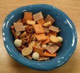
I thought my clay food project was the most successful. It looks very realistic, and since it is 3 dimensional, it has a nice composition and is interesting to look at. In fact, my piece has 65 pieces inside the bowl, and different pieces are visible from different sides, each with unique textures and colors. One of the difficulties I experienced was getting my textures just right, and I had to try many different techniques before getting it right since I had to imitate the actual texture, some of which were bumpy, flat, or in between. In my bread pieces and cheese puffs, I used the needle tool to get the tiny holes and cracks. In my pretzels and cheez-its, I made tiny little balls of clay to use as salt granules. For my chex, I used a tool to make tiny square impressions to create the texture. However, the most difficult part for me was getting the paint colors just right for my pieces. I wanted the colors of my piece to be the same as the actual snack mix, so I had to keep mixing colors and comparing them until I got it just right. This took a lot of time, and I had to think about what colors I needed to add to get it right. However, i think it did turn out well and had a variety of colors such as bright orange, white, and varying shades of brown that go well together and complement each other. I also chose to glaze my bowl in blue to contrast with the orange in my piece, so that the snack mix would pop. Part of my success can be attributed to the fact that I have worked with clay in the past before and have experience with sculptures/ceramics. All of these individual choices I made regarding each piece and the overall project added to the realistic nature and success of the project.
I thought my clay food project was the most successful. It looks very realistic, and since it is 3 dimensional, it has a nice composition and is interesting to look at. In fact, my piece has 65 pieces inside the bowl, and different pieces are visible from different sides, each with unique textures and colors. One of the difficulties I experienced was getting my textures just right, and I had to try many different techniques before getting it right since I had to imitate the actual texture, some of which were bumpy, flat, or in between. In my bread pieces and cheese puffs, I used the needle tool to get the tiny holes and cracks. In my pretzels and cheez-its, I made tiny little balls of clay to use as salt granules. For my chex, I used a tool to make tiny square impressions to create the texture. However, the most difficult part for me was getting the paint colors just right for my pieces. I wanted the colors of my piece to be the same as the actual snack mix, so I had to keep mixing colors and comparing them until I got it just right. This took a lot of time, and I had to think about what colors I needed to add to get it right. However, i think it did turn out well and had a variety of colors such as bright orange, white, and varying shades of brown that go well together and complement each other. I also chose to glaze my bowl in blue to contrast with the orange in my piece, so that the snack mix would pop. Part of my success can be attributed to the fact that I have worked with clay in the past before and have experience with sculptures/ceramics. All of these individual choices I made regarding each piece and the overall project added to the realistic nature and success of the project.
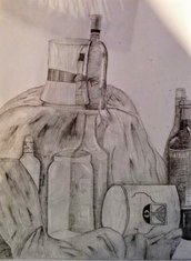 Look at your body of work over the semester and choose 2 pieces that show your growth as an artist. Discuss each piece and how you grew in the following areas: application of materials, techniques and skills, artistic vision, use of the principles and elements, creativity, intuition and subject matter. The pencil sketch above is the first project I did this semester. It shows a grouping of glass bottles and other items sitting upon a piece of cloth on a table. This piece does have dark and light values, but the transition between them and the medium values are a bit rough, and the whole piece looks a little muddled. Although I was able to capture some of the transparency and translucency of the glass, correctly portrayed the shapes and textures, and did show value, the piece looks a little flat overall. I think part of the reason this piece was not as successful as it could have been was because I was not very interested by the subject matter, and did not particularly enjoy working with the medium. However, one of my more recent pieces was done with colored pencil, which is quite similar to pencil, was a lot more successful. It was similar to my first piece, because black was my primary focus in this piece since my hair is black, and in the first piece, due to the medium I was restricted to only varying shades and tints of black. In this piece, I showed a lot more value, and I showed the shadow where each strand of the braid overlapped the other, and the highlight of where the braid protruded. The composition was also nice, with three similar strands of hair overlapping, but different enough to add interest to the piece. I also added many different colors, an element of art I was unable to show in my first piece, to this piece to show even more value. In the colored pencil piece, I was also able to portray the texture in a better way, and really captured the essence of the subject matter of this piece, which I found preferable to the glass bottles. These two pieces exemplify how I have grown as an artist over the semester, and have bettered my ability to show value, color, texture, depth, and overall make my piece interesting and realistic. |  |
Look over the blogs of other students in our class. Choose a piece of artwork from one of your classmates that you feel is an exemplary showcase of what the project was to depict. Think about how the artist used the medium, utilized the elements of art and design principles, was original with their ideas and went beyond their comfort zone or the realm of the requirements. Make sure you have the image of their artwork along with their name (first name only) posted with this response.
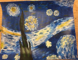
One of the pieces among my classmates that I thought was an exemplary showcase of what the project was to depict, was Carly’s version of Van Gogh’s “Starry Night”. To begin with, the composition of her piece to the original was almost identical, with the same shapes, positioning, and sizing. She filled the space well, with the right amount of used and unused space just like Van Gogh did as well. However, while the piece was very similar, she was still able to preserve her own style of painting, and her artistic abilities were still evident in the piece, and obviously differences did exist due to the fact that she used acrylic paint while Van Gogh favored oils. Secondly, she was able to successfully imitate the texture, using short brush strokes in varying shades to show the value of the piece. The colors are also very similar to the real piece, and she used many different shades and tints to show depth, value, and perspective. Carly’s use of texture and color create subtle patterns that are interesting and nice to look at, but do not draw attention away from the piece itself. Overall, the piece portrays all the main elements of art well, is interesting to look at, is very similar to her reference picture, and still stays true to her style as an artist. All of these aspects make her piece very successful.
One of the pieces among my classmates that I thought was an exemplary showcase of what the project was to depict, was Carly’s version of Van Gogh’s “Starry Night”. To begin with, the composition of her piece to the original was almost identical, with the same shapes, positioning, and sizing. She filled the space well, with the right amount of used and unused space just like Van Gogh did as well. However, while the piece was very similar, she was still able to preserve her own style of painting, and her artistic abilities were still evident in the piece, and obviously differences did exist due to the fact that she used acrylic paint while Van Gogh favored oils. Secondly, she was able to successfully imitate the texture, using short brush strokes in varying shades to show the value of the piece. The colors are also very similar to the real piece, and she used many different shades and tints to show depth, value, and perspective. Carly’s use of texture and color create subtle patterns that are interesting and nice to look at, but do not draw attention away from the piece itself. Overall, the piece portrays all the main elements of art well, is interesting to look at, is very similar to her reference picture, and still stays true to her style as an artist. All of these aspects make her piece very successful.
 RSS Feed
