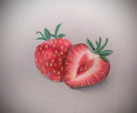
I chose this work to share because I think it really shows how I've grown as an artist. In this piece I think I have good contrast between the red of the strawberry and the green leaves, good blending in the strawberry, and good highlights and shadows where the strawberries overlap. My first assignment of this year was a Prisma color drawing of red and green apples. Since both of these subjects are really similar, it is easy to see how much my skill has improved over the course of this year. I have learned how to layer colors and blend them without the color muddling together. In this class, I have also been able to experiment with many different mediums that I haven't worked much with before such as oil paints, which I really had a fun time working with. I also enjoyed the workshops we did in class and learned from them that Prisma Color is my favorite medium to work with. I also realized that I really enjoy drawing beautiful objects with vivid colors in colored pencil on plain backgrounds. I think its really nice to just focus on the object that I am drawing, and not have attention drawn away from the piece. Before this class, I never really thought about symbolism in art pieces, but now, I am more aware of the meaning behind art, and the personal connections people can have with it.
I made this piece because earlier in the year we drew bubbles outside, and I thought it was really fun and interesting to add so much color to something that actually appears transparent. I wanted to do something creative for this piece and wanted to create a shape out of the bubbles. I also wanted to have solid color somewhere on the piece so that it had some structure, so I decided to make a purple girl in a bubble dress. For my oil painting, I painted a goat because goats are my favorite animal. I used a red underpainting in acrylic to make my colors pop and to add value to my piece first. On my goat, I created a fur-like texture using visual brushstrokes. I used a similar technique for my grass but I blended it out a little more in the grass because I didn't want the background to take away from the goat. For the sky, I used turpenoid to try and create an even background, and then also used thicker paint to develop clouds. For my personal symbol piece, I drew a pink rose in prismacolor. To me it symbolizes my family and my home because when we first moved to our home, my mom planted roses for me and lilies for my sister in our yard. My first doll was also named Rosie. I had a really hard time developing value in the piece without the colors blending too much or looking too cartoony. I think the texture and shadows came out really well though. I drew a picture of myself holding my cousin in colored pencil. I chose to draw this because I think the two figures are composed of many complex shapes that had to be drawn proportionally, and that required extensive shading. When drawing people, every tiny detail changes the piece drastically, which is why I chose to draw an image that consisted of both faces and bodies. The assignment was to create a piece that showed emotion, and I think my piece shows both the curiosity of my cousin in what I am showing her, and our closeness to one another. For my final piece, I drew a pile of jewelry. I found it difficult to create the different textures and the shine at first, but I kept layering colors and playing around with it until I got it just right. I practiced a lot on a separate piece of paper to create the color and shine I wanted. I really like the way the diamonds and gems turned out, but I'm not completely happy with the color of the pearls, because they look a little dull. The texture challenges we did earlier really taught me to layer colors and textures to create an object. At first I was a little overwhelmed to even start working on the piece, but I think the ten minute warm-ups taught me to just start drawing. I think that if I had longer to complete the assignment, I would have been able to perfect it.
I chose apples and the moon as my subjects, both of which are overdone and cliched in art. I merged these two ideas together and made them not trite by making a red apple slowly transition into a green one in different phases. It combines the shape and color of a subject that is overdone in art, with a unique aspect of the moon, that is again overdone. I think the red and green have a lot of contrast, especially against the black background, and create an interesting piece. If I have time, I would like to intensify the colors even further and shade the apples more evenly.
|
Archives
January 2018
Categories |