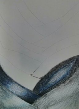
I used this sketch as practice to decide what color paper I should use and what techniques and colors I should use to make my piece look realistic. After doing this, I realized that my scale was off and that I needed to show a wider range of value.
|
|
|
I used this sketch as practice to decide what color paper I should use and what techniques and colors I should use to make my piece look realistic. After doing this, I realized that my scale was off and that I needed to show a wider range of value.
0 Comments
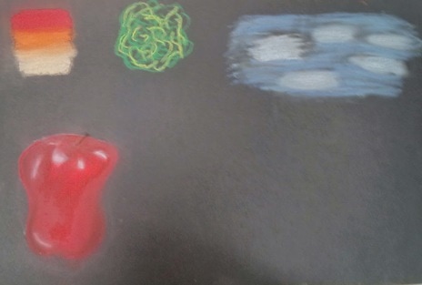 I practiced chalk pastel techniques on this sheet of paper. I made a gradient to practice blending colors. I also practiced how to show different textures and drew an apple using the techniques I learned. 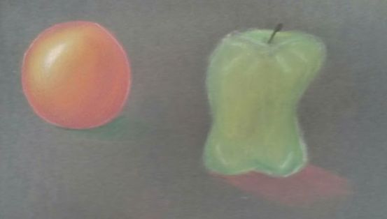 On this sheet of paper, I practiced using chalk pastel pencils. I did a sphere to practice using this medium and then did an apple once I got an idea of how to use the pencils.
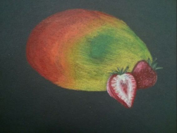 I drew a mango with two strawberries for my fruit project. I'm really happy with the way the strawberries turned out, but wish I was able to blend the mango better and make it look more realistic.
These are my colored pencil forms. I used different colored papers with different colored colored pencils and different shapes to practice using the medium.
These are my watercolor paintings of apples. I used four different techniques and used complimentary colored backgrounds in each painting so the apples would pop.
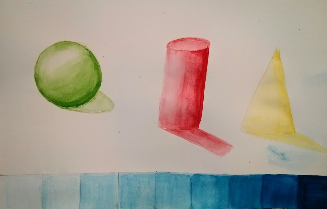 I have a sphere, cylinder, cone, and value chart showing different values done in watercolor
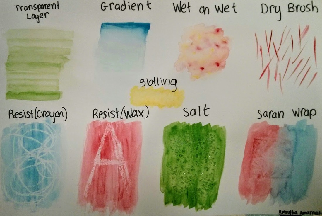 These are the watercolor techniques we learned in class: Transparent layer, gradient, wet on wet, dry brush, blotting, wax resist, salt, and saran rap.
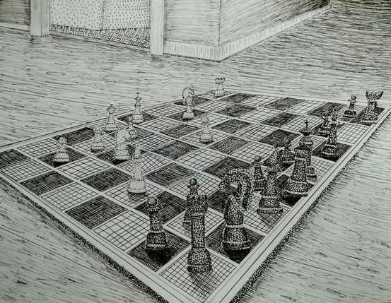
These are my in progress pictures for my pen perspective project. The first picture is just a pencil drawing of the board. The second and third show the board with more pieces and tiles filled in with pen, and the fourth shows the completed chessboard (without the background).
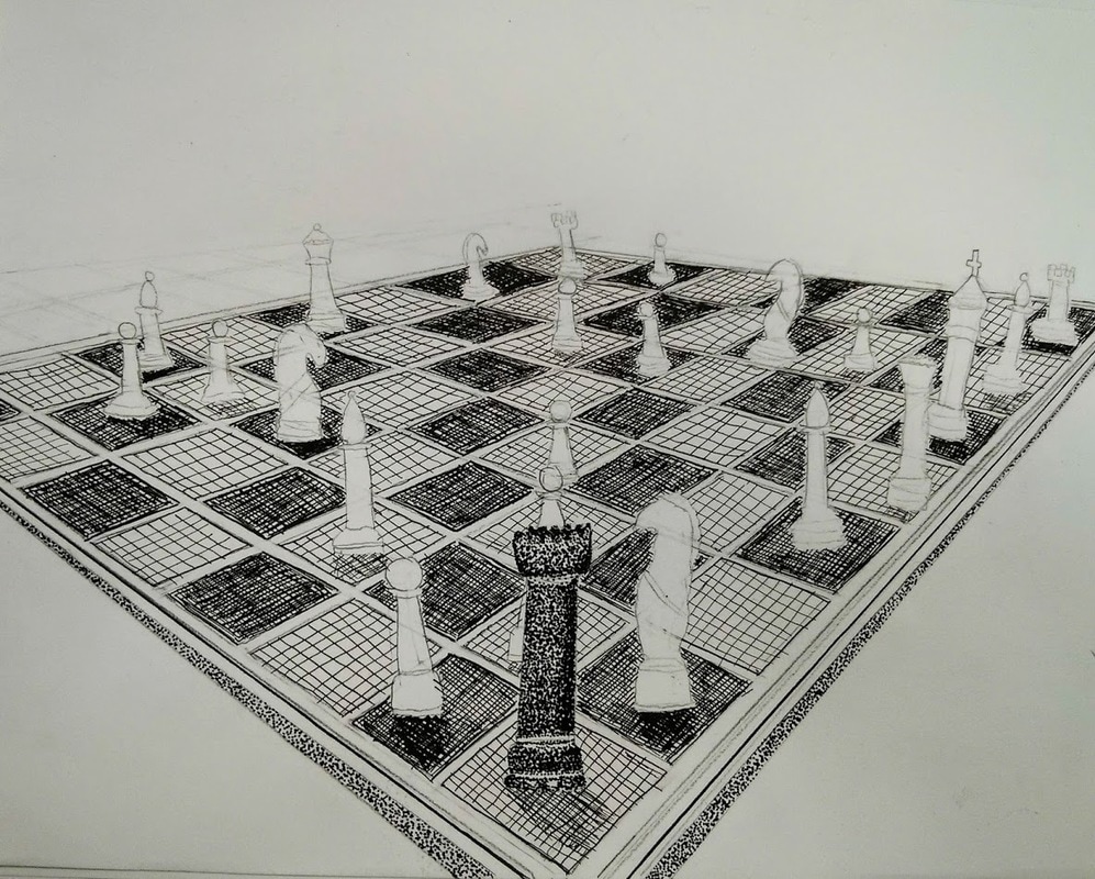 This is my rough draft for my pen perspective project. I used this sketch to figure out what techniques I should use, where I should use them, and how I could use value to show depth and perspective
|
Archives
May 2017
Categories |
 RSS Feed
