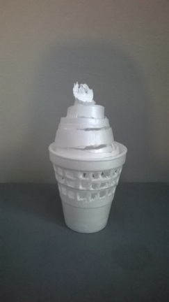
For this project I used two Styrofoam cups, and made an ice cream cone.
|
|
|
For this project I used two Styrofoam cups, and made an ice cream cone.
0 Comments
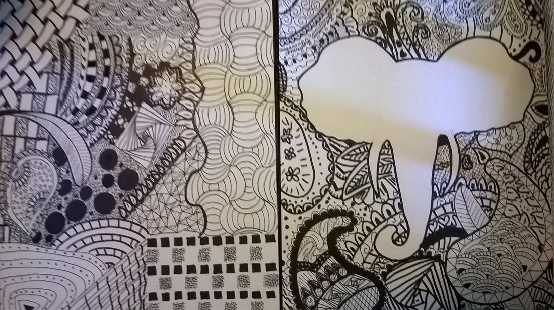 For ink week, I drew one piece using sharpies and made various designs abstractly. For my second piece, I made an elephant, and used sharpies to decorate the space around it.
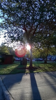 For my theme, I chose "Looking through" because I thought this was a unique perspective. I like this picture because you can see the sun and it's rays peaking out of the tree's branches, and the sun looked different at every angle as you walked around the tree. I also like that the sun creates the pink dot near the tree.
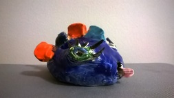 For this project, I made a dark blue fish with orange and light blue fins. I chose these colors because orange and blue are opposites on the color wheel, so they go well together. If I were to do this project again, I would have made the fish's shape more even, and I would have made the other body parts more to scaLe. I would also try to paint in many layers, so that I could cover all of the fish, and not have any translucent parts.
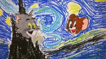 For this assignment, I chose to draw Tom & Jerry, and drew Van Gogh's "Starry Night" as the background. I used oil pastels, because that medium would be good for making many strokes, and blending the colors together. I chose to draw Tom & Jerry because that is one of my favorite cartoons. I chose to draw "Starry Night" because it is a very well known piece made by a popular artist. I also thought that the colors in Van Gogh's piece would go well with the colors I used to draw Tom & Jerry.
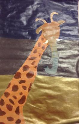 For this assignment, I chose to morph a giraffe, goat, and elephant together. I chose these animals because goats are my favorite animals, giraffes are my sisters favorite animal, and elephants are my moms favorite animal. I chose the most prominent body part of each animal:the neck of the giraffe, the horns of the goat and the trunk of the elephant. I chose to do acrylic paint because I wanted a smooth piece with shine, and I thought that acrylic paint would help me blend in the colors. I chose purple and bronze for the background because purple is my favorite color, and also happens to be the opposite of yellow on the color wheel, which is the color of the animal's neck, and I thought the shine of the bronze would bring attention to the piece. I liked how the features of the animal came out, but i didn't like that the edges weren't straight or sharp. I also disliked how i couldn't blend as well because the paint dried very quickly on the paper. I think that if I used a thicker paint so it wouldn't be as see-through, and I used a canvas, I could avoid these problems in the future.
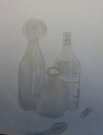 For this assignment, I chose to do a still life drawing in pencil. First, I drew the basic outlines and shapes for each of the items. After I got the outlines to scale I drew in the smaller details and shaded them in. This was the hardest part for me because the light hit the objects in certain areas, especially the glass bottles. I had to erase many areas to create the lighter areas and then go back and darken some parts too. I had to go back and forth many times to create dimension. After this, I blended the pencil and went back to a few areas to finish it up.
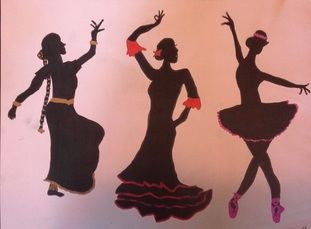 For this week's Illustration Friday, I chose to draw three dancers from different cultures. I chose this because I do Indian dance and I find other kinds of dance very fascinating. First I drew the three silhouettes.Then I used a marker to color in the dancers. The hardest part was drawing the faces because I drew the side profile for them. It was hard to get in the small details and show the face with just one color. Another difficulty I had was getting all three dancers the same size. I think this goes with the theme "People", because it shows three girls that have many similarities and differences.
|
AuthorAmrutha is a high school student who is currently taking Art 1. Archives
January 2016
Categories |
 RSS Feed
