- Describe the craftsmanship of your drawing. (Is it neat and well executed?)
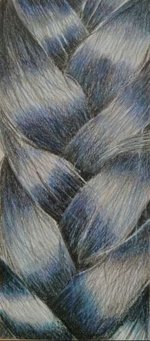
My piece is neat and well executed. I tried to maintain my good colored pencil techniques by keeping my lines straight and coloring in the right directions. It has good composition, good scale, and a good shape. I kept my pencil strokes pretty consistent throughout the piece. - Do you think you used a full range of values to create the illusion of depth?
I think I did use a full range of values to create the illusion of depth. I used darker values to show where one strand overlapped the other in the braid, and lighter values to show where the braid protruded and the light hits it. I used white, light blue, dark blue, blue purple, light purple, purple, and black in my piece to show depth. - How do you think you represented the style of the artist Georgia O’Keeffe?
I think I represented the style of the artist Georgia O’Keeffe with how close up my picture was. O’Keefe’s pieces were always close up and also had a range of vibrant colors. I tried to include bright colors in my piece as well even though my reference picture was mostly dark and black. I also tried to use a lot of texture like O’Keeffe always did. - Describe your choice of colors/color harmonies and how you used them throughout the artwork.
In my piece, I used white, light purple, violet, blue violet, blue, light blue, and black. Although my reference picture only really had black and shades of gray, I wanted to use more color to show depth and to make the piece a little more bright and interesting. I used black and darker blues and purples for my shadows, and white and lighter blues and purples for my highlights. I used black and white to blend my values together while still keeping individual strands to show that the hair is black, but just reflects other colors as well. I think the colors flow together well to show the illusion of depth and realness. - How did you create contrast in your drawing?
In each strand of my braid, I used black in the edges where another strand was overlapping to show the depth, and flowed into the white of the highlight in the center of the strand where the light hits the protruding portion. I used medium blues and purples to flow from the black to the white. The contrast in the drawing allows the viewer to differentiate the different strands of the braid instead of them all just forming one clump of hair. It also shows the depth of the braid and how the strands overlap and are closer or further based on the part of the braid they are in. - How did you use textures, highlights and shadows to enhance your artwork?
Texture is very important in my piece because although the hair is one object, it is made up of different strands that are made up of thousands of individual hairs. I needed to make many little strokes to show the different hairs while still blending them so they wouldn’t look like independent entities and instead look like one piece. I used highlights to show the parts of the braid that are protruding and where each strand curves and bends. I used shadows to show where one strand was on top of another creating a darker portion. Using these lights and darks allowed me to portray the depth of the piece. - Describe any difficulties you had creating your drawing and what you could do to improve your drawing?
I had a hard time adding in so much color to a piece that’s reference picture was completely black and white. I still wanted it to look realistic and look like black hair, but I wanted the piece to be more interesting and have a larger range of values. If I could do it again, I would try to make it look more like black hair and less like imaginary mermaid hair. I also could have done a better job adding in more highlights, but I wasn’t able to because I still needed to show that the hair is dark black.
 RSS Feed
