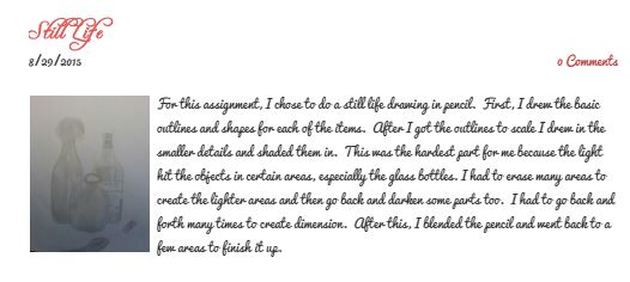
1. When you are critiquing a piece of art, the first thing to do is describe everything you observe about the piece. You should also identify the genre, and the materials and techniques used. After that, you analyze what the focal point is, how repetition of used, and what elements are used in the piece. The next step is to interpret what is happening in the piece, what the artist is saying, and why the artist made the piece. Finally, you decide what your opinion on the piece is. You state what you like and dislike about the piece, then evaluate whether or not the artist is successful, and explain your opinions.
2. Here is a critique I did on an older piece a couple of months ago.
3. Critique of my artwork:
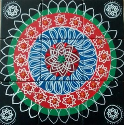
Before beginning this piece, I drew out a rough sketch on a piece of paper the same size as my tiles. On this piece of paper I figured out what designs I would use and practiced drawing them. I also wrote out what colors I would use, measurements and planned the layout of the piece . After this I sanded the tiles a primed them so the paint would stick. After that I painted in my background, sketched the main shapes with pencil, and then painted in the colors.The main colors in my piece are black, green, orange, blue, red, and white. Then, I went back with a paint pen and added in the designs. The texture of the piece was very smooth, but I embellished this piece with gems and beads to add some dimension. There are a lot of circles, geometric print, free hand patterns, and symmetry in mu piece. It is made up of vibrant colors in light, medium, and dark values that stand out, but still work well together. The focal point of my piece is the center, and the rest of the piece revolves around it, which is appealing to the eye. The repetition and symmetry creates a sense of unity. There are a lot of designs to look at, but I think there is enough negative space to compliment the patterns. I would classify the genre of this piece as cultural art. This piece is a rangoli, a design made with colored rice flour in India outside of homes and temples to welcome in visitors. The bright colors and intricate patterns that stand out make me feel happy and excited, because rangolis are often made for celebrations. I also have a lot of good memories making them with my mom and grandmother when I was younger, and looking at the rangolis when I visit India. I think the most important part of the piece is that it is just so bright, vibrant colors that capture the eye. I created this piece to share my culture, and also because I always enjoyed making them so much. I like the captivating colors and intricate designs in the piece, but I dislike that the patterns are not as perfectly spaced out as I thought they would be. If I were to do the project again, I would plan it out more beforehand, and measure everything before painting. Overall I like my piece because it shows my culture, it has elaborate designs, eye catching embellishments, vivid colors, and I associate it with good memories.
Before beginning this piece, I drew out a rough sketch on a piece of paper the same size as my tiles. On this piece of paper I figured out what designs I would use and practiced drawing them. I also wrote out what colors I would use, measurements and planned the layout of the piece . After this I sanded the tiles a primed them so the paint would stick. After that I painted in my background, sketched the main shapes with pencil, and then painted in the colors.The main colors in my piece are black, green, orange, blue, red, and white. Then, I went back with a paint pen and added in the designs. The texture of the piece was very smooth, but I embellished this piece with gems and beads to add some dimension. There are a lot of circles, geometric print, free hand patterns, and symmetry in mu piece. It is made up of vibrant colors in light, medium, and dark values that stand out, but still work well together. The focal point of my piece is the center, and the rest of the piece revolves around it, which is appealing to the eye. The repetition and symmetry creates a sense of unity. There are a lot of designs to look at, but I think there is enough negative space to compliment the patterns. I would classify the genre of this piece as cultural art. This piece is a rangoli, a design made with colored rice flour in India outside of homes and temples to welcome in visitors. The bright colors and intricate patterns that stand out make me feel happy and excited, because rangolis are often made for celebrations. I also have a lot of good memories making them with my mom and grandmother when I was younger, and looking at the rangolis when I visit India. I think the most important part of the piece is that it is just so bright, vibrant colors that capture the eye. I created this piece to share my culture, and also because I always enjoyed making them so much. I like the captivating colors and intricate designs in the piece, but I dislike that the patterns are not as perfectly spaced out as I thought they would be. If I were to do the project again, I would plan it out more beforehand, and measure everything before painting. Overall I like my piece because it shows my culture, it has elaborate designs, eye catching embellishments, vivid colors, and I associate it with good memories.
| |
 RSS Feed
